News
Samsung One UI 3.0 Features: Latest, Changed, Improved, and Optimized

Samsung introduced One UI at SDC 2018, a new mobile software skin based on Android OS, designed for Samsung smartphone and works on the philosophy of “focus on what matters most”.
The South Korean tech giant made some big changes in the One UI user experience compared to the predecessor “Samsung Experience” and brought simplicity on performing tasks under reach your hand’s thumb.
Including its initial version, Samsung has released six One UI versions since its launch:
- One UI 1.0
- One UI 1.1
- One UI 1.5
- One UI 2.0
- One UI 2.1
- One UI 2.5
With these One UI versions, Samsung has improved the overall user experience, improved One UI’s system performance, and added new features.
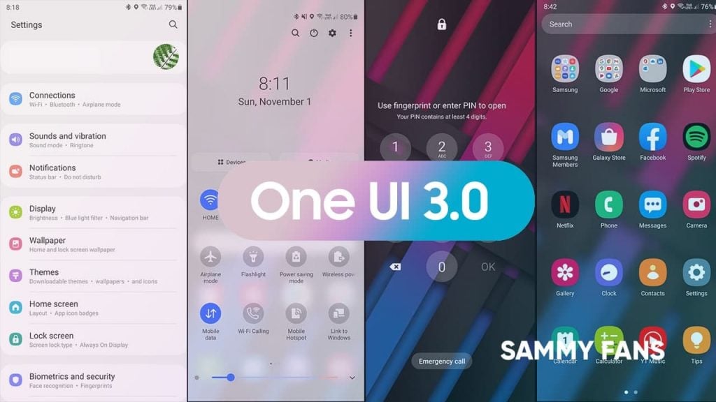
Aside from the history, the next version of Samsung’s mobile software, the One UI 3.0 is here. And the One UI 3.0 is out on the device with the Beta testing program.
With One UI 3.0, Samsung has made some remarkable changes in the user interface and accessibility that can easily reflects on the quick settings panel, settings menu, the app drawer, and other parts of the UI.
One UI 3.0 is based on Android 11 and brings you some of the features from the Android ecosystem.
One UI 3.0 beta is out and we’ve examined this new One UI version to extract every single new thing that Samsung included in this new One UI.
Want to download the Wallpaper used In this tutorial? download it from here.
One UI 3.0 Features and Changes that we’ve discussed in this article:
- Quick Settings/Notification Panel Redesign
- Volume Control
- Settings Menu
- Always on Display (AoD)
- FaceWidgets
- Double Tap To Sleep
- Notification Type and History
- Redesigned Long Press application menu
- Home screen, App Drawer, Folders, Finder and Recents
- Device Care
- Video enhancer
- Gallery App
- Caller screen layout
Lock screen:
Once you update your smartphone to One UI 3.0, the lock screen will be the first door that you need to unlock before moving to the world of new user interface changes.
But once you reach the lock screen, you’ll start noticing the changes in the user interface by yourself. The lock screen now has smoother fingerprint animation and a new lock icon hovers on the top center.
UI of the unlock method such as PIN UI is also changed compared to One UI 2.5 and comes with a dialer with round backgrounds that look very good.
Furthermore, the shortcut on the left and the right side has been grayed out and the respective apps open with a brand new animation from each side.

One UI 3.0: Lock Screen
Home Screen, App Drawer, Folders, Finder, and Recent Apps:
Talking of changes, how can we forget the important part of the user interface that you access most of the time in a single day.
The new effect in the user interface may seem little but it definitely improves the user experience.
Home Screen appears the same but when you open the App Drawer and Recent Apps, the new transparent background (Similar to the notification) will also be found here and more visible. Not only that, it helps you to view the apps and recent apps section better than before.
Moving on, Samsung has added some new functionality to the finder, which includes your recent apps, suggests, files in storage, and recent searches in different cards.

One UI 3.0: Home Screen

One UI 3.0: Home Screen
Quick Settings/Notifications Panel Redesign
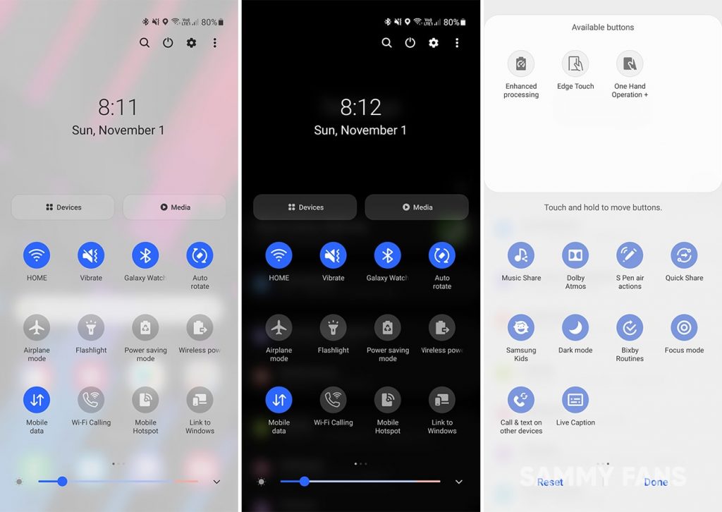
One of the major changes in the One UI 3.0 includes the Notifications and Quick Settings panel overhaul.
The background of the Quick Settings panel has a semi-transparent blurred background, which increases the overall viewing experience and better highlights the quick setting buttons.
The Media and Devices options are now placed above the buttons. While, the search, power button, settings, and more menu icons are moved to the top right corner of the screen. Also, the date is moved to the center area. To mention, the edit button option has also received some changes.
One UI 3.0: Notification Panel
Redesigned Volume Controls:
Samsung has completely redesigned the volume control panel and each control for Ring, Media, Notifications, and System and now appears “Vertically” instead of Horizontally in One UI 2.5.
The background of the volume controls has the same transparent and blurred finishing as the quick settings panel. It kinda looks cool.

One UI 3.0: Volume Controller
Settings Menu:
The Setting interface and its elements are one of the cleanest and nicely designed menu in any Android smartphones. The One UI 3.0 brings a redesigned and restructured settings app menu, which looks even better than before.
Talking first about the Samsung Account menu card, which has a bigger view of details such name, email, and profile avatar.
Coming to the menu items, the icons in the menu brings better and improved settings icons, and most importantly, a new color palette that looks way better than One UI 2.
Moreover, the subtle change in the spotlight feature is also noticeable and separated with dots instead of dashes (in One UI 2).

One UI 3.0: Settings Menu
Always on Display (AOD)
The Always-on Display is also improved with One UI 3.0 and now offers better AOD features.
The latest implementations in the AOD section bring new clock styles that now supports animated GIFs with some tiny customizations. Once you lock the phone, the GIF starts to play for a limited time.
You can also set an image from Gallery or download AOD themes from the themes store.
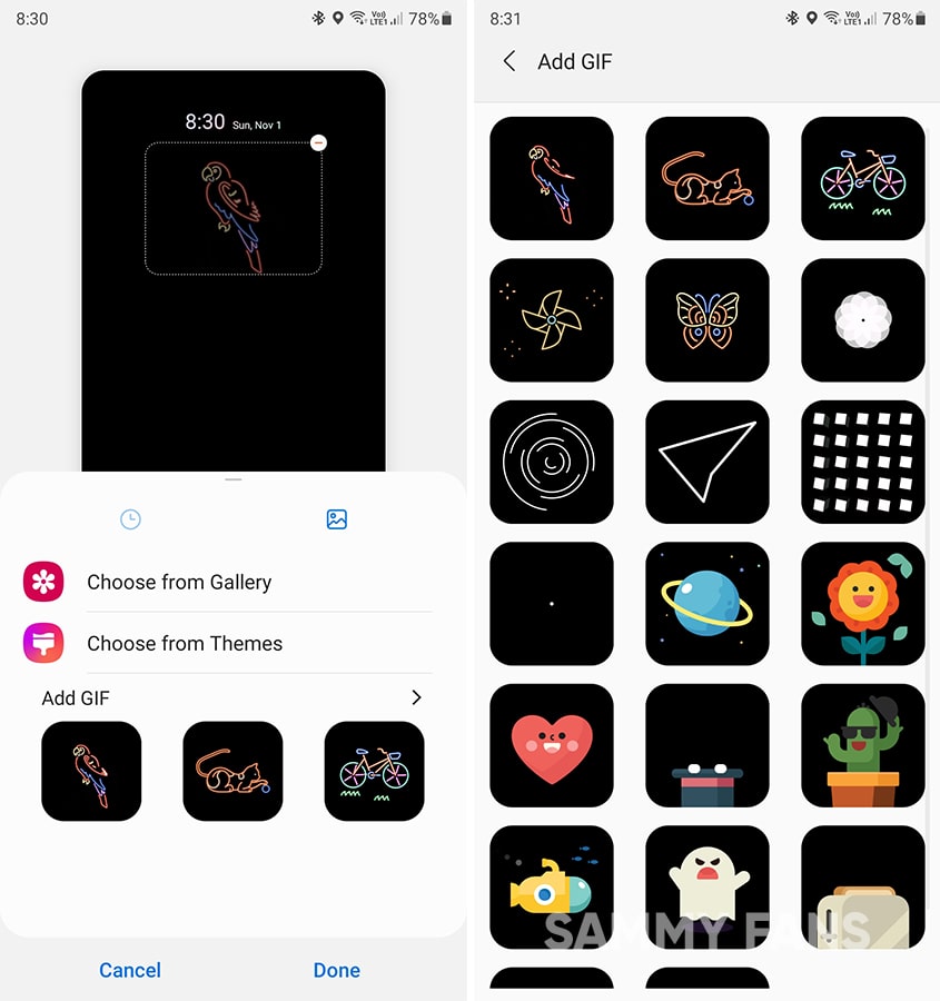
One UI 3.0: Always On Display GIFs
New FaceWidgets:
FaceWidgets are useful to get quick access to certain functionality including music playback, schedule, alarm, weather, Bixby routines.
With One UI 3.0, Samsung has given this lock screen feature a big overhaul and when you tap on the clock, you now have the option to swipe up or down. Once, you do this, there’s a whole screen with different cards will pop-up to provide a better view of the widget information than it was in the One UI 2.5.

One UI 3.0: New Face Widget
Double-tap to Sleep:
One UI system offers a feature to wake up the lock screen by double-tapping on the display and One UI 3.0 adds a new feature to sleeping the display by double-tapping to the screen, while the lock screen is on.

One UI 3.0: Tap To Sleep
New Notifications:
One UI 3.0 allows you to set how notifications will show as they arrive. In the notification panel, notifications are grouped to make them easier for you to read at glance.
Ongoing conversations in your chat and messaging apps are shown on top so you can get them quickly. Alert notifications will give you an indication when they arrive. Silent notifications provide useful information without interrupting you.
To make the notification viewing experience simpler, One UI 3.0 now allows you to select between Brief and Detailed notification styles:
Brief: It’ll allow you to see text-only pop-up notification details. You’ll have the option to select a specific app that will be shown as brief. Moreover, you select the color of the notification by a keyword and even show while the screen is off.
Detailed: The Detailed view will appear in the notification bar, which is seen as usual.

One UI 3.0: Notification Settings
Notification History: With Android 11, Google introduced the new Android notification history manager, which now keeps the history of your notification.
This feature is now implemented in the One UI 3.0 and allows users to keep the history of recent and snoozed notifications.

One UI 3.0: Notification History
Redesigned Long Press on an application menu
Long press on an application option is very useful to open a set of features to view a notification or select from a range of services related to the respective app. This feature has been revamped with One UI 3.0.

One UI 3.0: Long Press Button
Battery and Storage Management:
The Device Care feature is in the Settings is now renamed to “Battery and device care”. Both Battery and Storage screen also received some noticeable changes in their features respectively.

One UI 3.0: Battery and Storage (Device Care)
Video enhancer:
Video enhancer improves the image quality of your videos to enjoy brighter and more vivid colors. This feature supports Samsung’s native video player, YouTube, and Netflix and on One UI 3.0, it supports Google Play Movies & TV.
Also, users can turn on or off an individual app by using the Video Enhancer feature, using the switches.

One UI 3.0: Video Enhancer
New Gallery App UI:
Yes, we’ve to talk about the Samsung Gallery app, and One UI 3.0 has brought new changes in this photo or video viewing application.
The options from the Gallery app user interface is now restructured. Beginning from the top, the options previously had Videos, Favorites, Locations, and Suggested sections to sort out images and videos in respective categories.
In One UI 3.0, these options are gone but only from the top and moved to the bottom bar inside the new hamburger icon menu alongside Trash and Settings features. Also, the same restructuring has been made throughout the Gallery app.

One UI 3.0: Gallery User Interface
Caller screen layout and caller background:
One UI 3.0 makes your calling experience even better because you select a picture or video to show You can select a picture or video to show when you make or receive a call.
You can also choose a layout on how to show caller info when the person has a profile picture.

One UI 3.0: Call Screen
Recycle Bin for Phone and Messages:
One of the most important features, Trash is now added to the Phone and Messages app. Once you delete a message or a contact it’ll go to their Trash respectively and it’ll stay there for at least 30 days before it deletes permanently.
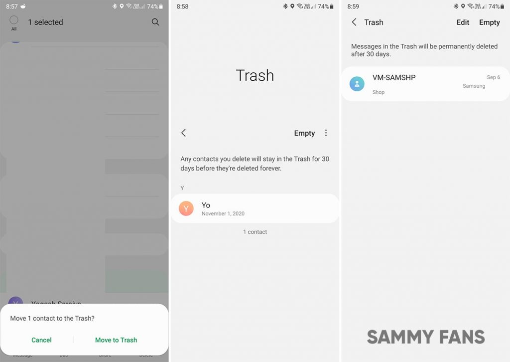
One UI 3.0: Contact and Messages Trash
One UI 3.0 Rollout:
Samsung is currently rolling out One UI 3.0 for Galaxy S20 and Galaxy Note 20 series devices in different markets and the company are also preparing to rollout this latest One UI version to more devices.
If you want to know the list of eligible devices and the latest news regarding the One UI 3.0, take a look at the articles linked below.
News
Samsung Gaming Hub adds the biggest Xbox Game Pass titles

Owners of select Samsung Smart TVs, monitors, The Premiere 7 & 9 projectors, or The Freestyle 2nd Gen can stream Call of Duty: Black Ops 6, Flight Simulator 2024 and hundreds of other games with Gaming Hub Xbox Game Pass.
Call of Duty: Black Ops 6 and Flight Simulator 2024 are two of the most popular games of 2024. Thanks to Samsung Gaming Hub, you don’t need to download any of the Xbox Game Pass titles, no meaning no storage required – just jump in and play.
The company has also built an engaging gameplay experience designed by fans, for fans through The Six, challenging players’ knowledge and providing another way to interact with the world of Call of Duty: Black Ops 6.
Notably, Samsung’s Gaming Hub is available on a variety of Samsung screens. It includes the AI-powered 2024 TV lineup, monitors, projectors, The Premiere, and The Freestyle 2nd Gen projector, offering instant access to console-free gaming.
Anyone with a Samsung Smart TV will be able to use their remote to jump in and play. This way, Gaming Hub provides a co-branded experience, giving Call of Duty fans another way to engage with the franchise they love.
For starters: The Six offers daily trivia where players can answer a series of six questions in competition with other players around the world. Correct answers with the fastest response time will achieve higher scores.
News
Surprising: Samsung to launch Galaxy ixi-O AI Phone next year

Samsung could launch the Galaxy ixi-O AI Phone next year. The company has collaborated with LG Uplus to develop a custom smartphone. The device is said to feature Galaxy AI and LG Uplus’s AI call assistant ixi-O.
Sources citing KEDGlobal revealed that Samsung and LG Uplus working together to develop the Galaxy ixi-O AI Phone. It’s a big development in the smartphone industry, while the handset is highly likely to be Korea-limited.
Samsung fans are well aware of the Galaxy AI feature suite. ixi-O is an AI-powered digital assistant developed by Korean carrier LG Uplus. The company plans to enter the smartphone market, featuring its own-developed AI assistant.
The report indicates that Samsung and LG Uplus’ ixi-O AI Phone will launch as early as next year. The development project focuses on crafting a “real AI phone” that goes beyond simply integrating AI assistant services into a smartphone.
ixi-O comes with useful features such as AI call answering, detecting voice phishing in real-time, recording and summarizing phone calls and converting voice conversation into text – all within an on-device environment.

Image: ixi-O AI | LG Uplus Newsroom
Based on specifications, the Galaxy ixi-O AI Phone will be based on a Galaxy phone available globally. The design will match with a global Galaxy smartphone, but the software may be tweaked as per the carrier’s requirements.
A custom Galaxy phone isn’t shocking or impossible in South Korea. Samsung releases Quantum, Buddy, and Jump-branded phones in the market. The company collaborates with Korean carriers to bring these devices to mainland Korea.
The carrier introduced an on-device AI-powered ixi-O assistant earlier this month. LG Uplus will initially target its consumer base for the new AI Phone. However, the AI Assistant may be expanded to a broader audience across Korea.
News
Will Galaxy S25 Ultra will use Samsung’s Gauss2 GenAI Model?

Samsung could use Gauss2-based Galaxy AI on the Galaxy S25 Ultra. The company’s next-gen Generative AI model is 1.5 to 3x faster than the first-gen Gauss model. The DX division is already using Gauss2 to ramp up internal productivity.
Gauss2 offers improved performance and efficiency in simultaneously handling various data types. In the previous article, we’ve demonstrated its three distinct models that cater to different purposes: Compact, Balanced, and Supreme.
Samsung says the second-gen Gauss model offers equal or superior performance in response generation than leading open-source generative AI models. That said, the Galaxy AI will become faster and smarter with the inclusion of Gauss2.
Thanks to faster processing speed, Gauss2 enables quicker AI response generation. This way, the Galaxy user won’t have to wait much time. The company stated that it will continue to expand the reach of its AI-based services across all product lines.
That said, the Galaxy S25 Ultra is likely to boast Gauss2-based Galaxy AI. This upgrade will result in even faster processing of tasks and execution. Features like composition, image generation, and translation would benefit from Gauss2.
Earlier, we broke the news that Samsung is crafting an advanced AI technology. The Gauss2 press release indicates that the future Galaxy AI iteration could be integrated with knowledge graph technology to offer relevant results.
The Galaxy S24 series also uses Google’s Gemini Nano AI model. The fruitful collaboration offers futuristic capabilities on Galaxy devices. Samsung is rumored to use an enhanced version of Gemini Nano across the Galaxy S25 lineup.
Meanwhile, Samsung’s development may have indulged Gauss2 capabilities on the Galaxy S25 series. Integrated with new processors and optimized software, the company’s AI model would offer faster, reliable, and smarter results.


