One UI
One UI and One UI 2 Recap: How Samsung made software usability friendly for smartphones users

Compared to the past, where cell phones have physical buttons and a limited number of features, smartphones now offer a wide range of functions that can be accessed by interacting with the touch screens of our devices. However, using the same component that serves as the device’s viewing experience for the primary input tool that can sometimes present difficulties for users.
This is where the user interface (UI) of the device is enabled, referred to as the user experience (UX). In 2018, Samsung introduced an improved version of its standard user interface called One UI and proceeded with the Samsung Experience.
In addition to working to make them real, consistent, and effective, UX designers try to create user interface interactions on the use of physical objects around the world.
For example, users can turn a digital page into an e-book such as a physical page or slide their card into the Samsung Pay app and assume how the card is removed from their wallet. What do UX designers do when there is no way to communicate in real-world activities.
Read More: Samsung Galaxy S8 and S8+ getting October 2020 security update in the U.S.
An interface that helps you stay on top of work
One UI was launched with the idea of helping today’s busy users by simplify communication and focus on their smartphones. Explaining that the interface is based on the concept of ‘everyday simplicity’, the One UI is designed to focus on important tasks without distracting users.
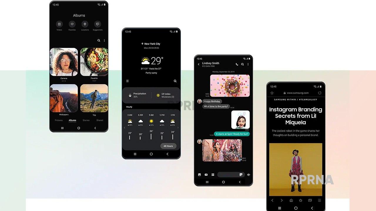
Now, the One UI has been further developed into ‘One UI 2’, which was unveiled late last year. This upgrade interface combines icons from the One UI into new styles and configurations, including updated colors and motions. Additionally, One UI 2 makes specifies icons with different color tones and movements, for example, when the ‘Settings’ icon vibrates to notify users that updates are taking place.
Simplicity helps you focus on the important things
Simplicity is a top priority for designers when developing One UI 2. Therefore, the pop-up screens at the top and bottom of the screen are more compact and simple, keeping the features out of the user’s view.
The camera app has been simplified to ensure that the basic functionality of the app is continuous and to prevent users from getting distracted while taking their pictures. UX designed for the camera app and further enhances the user experience.


Basic photo and video modes can be accessed at the bottom of the screen, but special modes such as Food and Night modes can be accessed by selecting or swiping and more, which simplifies the screen display so that users can focus on capturing their image.
Comfort for your convenience so it can be easily taken with your eyes and fingers
Helping to make user interactions more convenient, streamlined, and one-handed is at the lead of One UI 2 development. At the same time, the upper and lower parts of the UI screen are divided into ‘view’ and ‘interaction’ areas, respectively, allowing the One UI 2 to complete most tasks at the bottom of the screen.


Furthermore, it minimizes unnecessary finger movements to improve comfort and convenience, for activities that require interference at the top of the screen.
The same principles apply to the keyboard, allowing users to do other things while placing their fingers in the keyboard area. For example, the long-pressing of the space bar allows users to control the position of the cursor inside the keyboard window without interacting with the main text body.


Additionally, users can undo and repeat actions by swiping left or right with two fingers and adjusting the keyboard dimensions to fit by hand.
Dark Mode
The Dark Mode feature has been shown to reduce eyestrain and expand the number of applications that One UI 2 applies to. Dark mode has been extended to many applications that were previously difficult.
It also applies dark filters to background wallpaper displays to make tools darker. The combined algorithm automatically displays the color-time that analyzes the background image on the lock screen, which looks great toward the background.
Convenience effectively enriches great experiences
The Single Take feature comes with the One UI 2 in the Galaxy S20, which can deliver different photo styles and effects in a single shot with Ultra-wide, Live focus, and short video features. In addition, it introduced a new type of viewer to allow the user to see different results at once on the same screen.
The video calling feature has been further upgraded by integrating Google’s Duo, Google’s simple and high-quality video calling application.

Some other user experiences specifically for Galaxy devices, this integration brings the first 5G video calls to smartphones, allowing users to enjoy FHD video calls and use AR emojis and widescreen mode with their video calls. They continue to develop innovative and integrated communication experiences integrated with phones, messaging, and contact applications.


Galaxy Foldable Designed Features
The Galaxy Z Flip represents a completely new style device with a revolutionary design. Therefore, designers need to think outside the box, the question is how to provide the best level of usability and functionality in a new smartphone.
The Designer is responsible for developing the UI for the Galaxy Z Flip. We do not have access to any sample devices that apply to the new UI. In this unique UI design, the designers include a cover display, extending the interface outside the phone to a smaller screen. Thus allowing users to check the time, read notifications, and take selfies when the phone returns.


Special efforts have been made to develop a UI for the Galaxy Z Flip ‘Flex Mode’, a feature that split the screen in half when the phone is folded in half and set at a 90-degree angle. The design team handles this unique form element.
The real challenge is to create a UI that is compatible with the phone used in Flex mode. We have created a new layout that reflects the UIs found on older foldable phones.
Accessibility to everyone
Accessibility means the availability of the device’s convenience and features by a wide range of users. The designers of the One UI 2 worked to provide an equally accessible experience for all, despite age or disability
With features such as high-visibility themes that maximize the use of visually impaired users. Samsung has approached users from various abilities to receive feedback on accessibility in the UI and to understand user’s thoughts on where to improve.
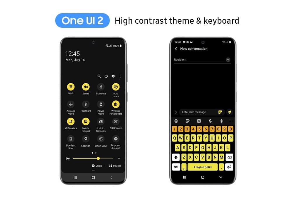
As a result, color adjustments and higher visual contrast features have been implemented in the UI to increase usability for more efficient users. These changes make it easier for users to access special features such as light sensing, which detects nearby lights and notifies users of their status via vibrations and is a Live transcribe used by Bixby to copy audio messages and nearby sounds.
One UI to satisfy individual user
Since the first and second matters of One UI are intended to set the framework for the interface, the next steps will focus on feeding more individual users. “Going forward, the UI will provide more customized content,” says Yim. “Bringing active customization to improve the personal user experience.”
As they continue their development work, UI designers work to provide the best possible environment for Galaxy users, while at the same time integrating the interface and making old-fashioned content reminiscent of the past.