Comparison
Battery Widget – Samsung One UI 5.1 Vs Apple iOS 16

Samsung introduced a new battery status widget feature with the new One UI 5.1 software. Sadly, it’s not a new innovation as Apple’s iOS and Pixel’s Android already have such kind of widgets. Well, here we compare the battery widget of Samsung’s One UI 5.1 and Apple’s iOS 16 operating system.
Follow our socials → Google News, Telegram, Twitter, Facebook
Apple Battery Widget
Since Apple has already brought the battery status widget to iPhones, it has mastered the feature with generation improvements. In the latest iOS 16, there are three different battery widgets available on iPhones including a square (single), a rectangular (list), and a circular (4).
Samsung Battery Widget
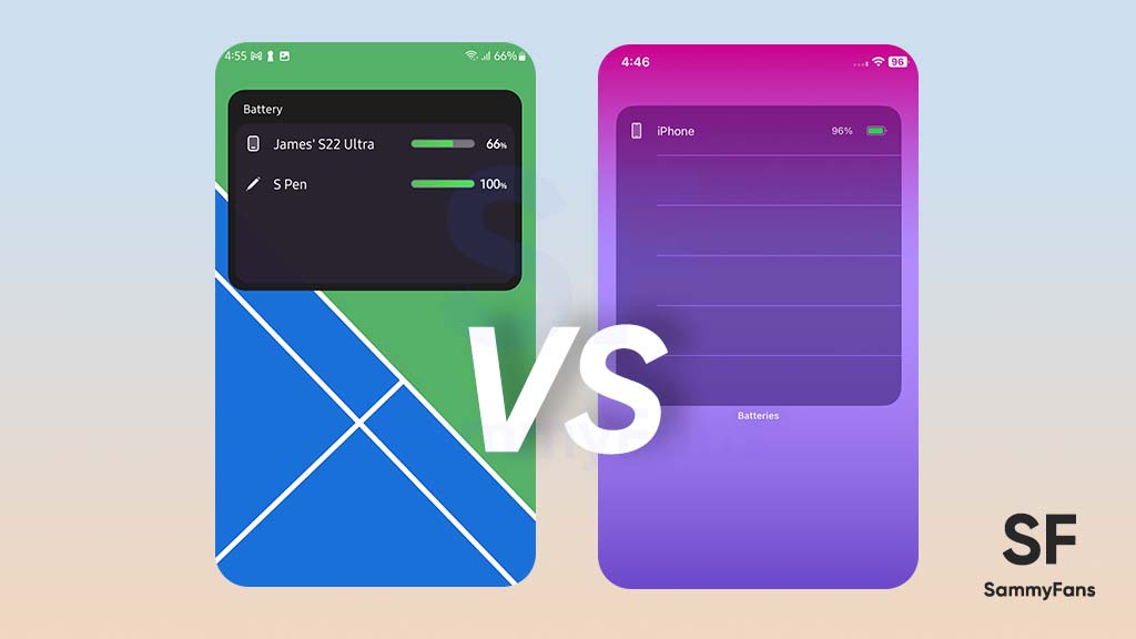
Samsung’s battery widget introduces two choices for Galaxy consumers including the circular and square box styles. Both of the choices let you display the battery status of up to 8 devices including the smartphone itself. By default, the widget expands for 4 devices, which can be further enlarged for eight.

Comparison
One UI 5.1’s circular battery widget doesn’t have any background layer as all circles are arranged independently. On the flip side, iOS 16’s circular widget has a transparent layer so it can be clearly visible in any kind of wallpaper or home screen theme.
The One UI 5.1’s circular widget shows the device icon and percentage inside the circle, whereas the iOS takes additional space beside for percentage.


Talking about the second style, the rectangular widget of One UI 5.1 looks way better than the iOS 16’s. It has a solid background layer with an intuitive interface as well as a header, device icon, battery percentage bar, and text.
On the other hand, iOS 16’s rectangular battery widget keeps the same transparent background layer and occupies much space on the home screen. One UI can show the status of up to 8 devices, while iOS is limited to just 4.


Verdict
- Tied!
Apple’s battery status widget is unquestionably mature, compared to the first version of Samsung’s battery widget. Still, Samsung did a pretty good job when it comes to personalization of the widget and usability with a high amount of devices.
The circular widget of Apple looks better than the One UI, while the rectangular-styled widget of One UI clearly defeats iOS. It’s pretty difficult to make a winner in this comparison, as both have their own specialties and limitations. Well, which one do you prefer? Let us know through social media!