Apps
Samsung updates Bixby Wakeup and Dictation apps in July 2023
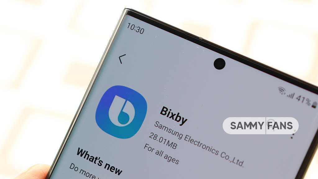
Samsung is rolling out the July 2023 update for Bixby Wakeup and Bixby Dictation apps. The new update of these apps improves some functions to provide a better Bixby performance.
The new update fixes some issues that Galaxy users facing after the last version. It also enhances the stability and reliability of these apps so you can get a bug-free and amazing experience.
Users of Galaxy devices can identify the latest update of Bixby Wakeup and Bixby Dictation apps through the versions mentioned below.
Bixby Dictation
- Version: 3.0.25.3
- Package size: 30.27 MB
Bixby Wakeup
- Version: 2.3.25.14
- Package size: 52.1 MB
July 2023 update for Bixby Wakeup and Bixby Dictation apps rolling out gradually so it may take some hours or days to reach all eligible devices. To install the latest update, you can visit Galaxy Store >> Menu option >> Updates.
Apps
Samsung Wallet app v5.5.61 now available on Galaxy Store
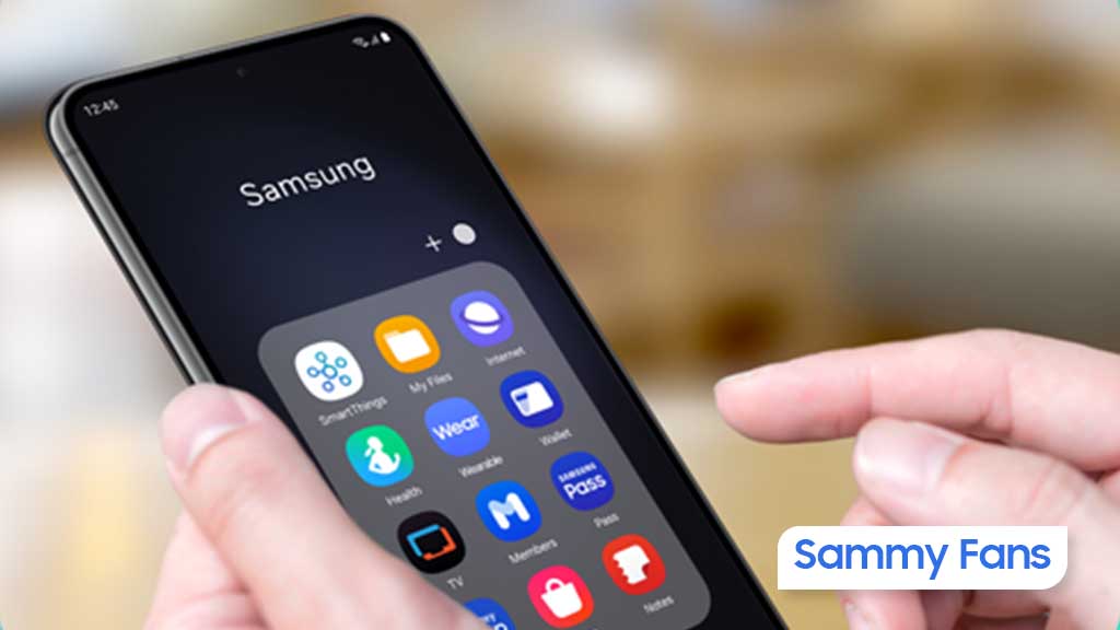
Samsung Wallet app is getting a new update with v5.5.61, which aims to improve app performance to make it easier to use. The fresh update is available on the Galaxy Store with a package size of 109.92 MB.
As more people rely on digital wallets for everyday transactions, Samsung is focused on keeping its Wallet app secure and user-friendly. The latest update addresses some issues that users have reported in previous updates to make the app run more smoothly.
In addition to fixing bugs, the update brings improvements to some features that users frequently rely on. It enhances the overall performance of the app. However, it does not include any new features or changes.

Users can download the Samsung Wallet v5.5.61 update through Galaxy Store >> Menu option >> Updates. Also, you can download the update from the third-party app link mentioned here.
Recently, Samsung introduced support for a Digital Key for Audi vehicles via the Wallet app. It offers Galaxy smartphone users a more convenient way to access and start their cars without the need for a physical key. This feature is powered by ultra-wideband (UWB) technology to ensure precise functionality and enhanced security.
Moreover, the Korean tech giant is also improving the Samsung Wallet app for Galaxy Watch to allow users to handle their financial needs conveniently, right on their wrist.
WhatsApp adds quick camera shortcut to gallery sheet
WhatsApp has pushed a new beta update for Android users, which brings a camera shortcut directly to the gallery sheet to make it easier to access the camera while sending photos or videos. The fresh beta update arrives with version 2.24.24.23, available through the Google Play Beta Program.
Previously, WhatsApp improved the way users send photo and video albums. With that, users can select multiple photos and videos at once, and add captions to entire albums to make it simpler to share media with context.
The new update is adding even more improvements. The camera shortcut, which used to be in the chat bar, is now available directly inside the gallery sheet. It saves time and makes it easier to capture something new without navigating through multiple steps.

Now, when you’re selecting photos or videos to send, you can quickly switch to the camera without leaving the gallery. This new change might feel like an extra step for some users who were used to accessing the camera with a single tap from the chat bar. However, the update aims to combine both the camera and gallery functions into one place.
Notably, not all users will see this new camera shortcut. If you still have the camera shortcut in the chat bar, you won’t see the one in the gallery sheet. This is to avoid clutter and make the app more organized.
This feature is currently available to a limited number of beta testers, and it will be rolled out to more users in the coming days or weeks.
Apps
Google Messages to improve backup process with encrypted in-app feature
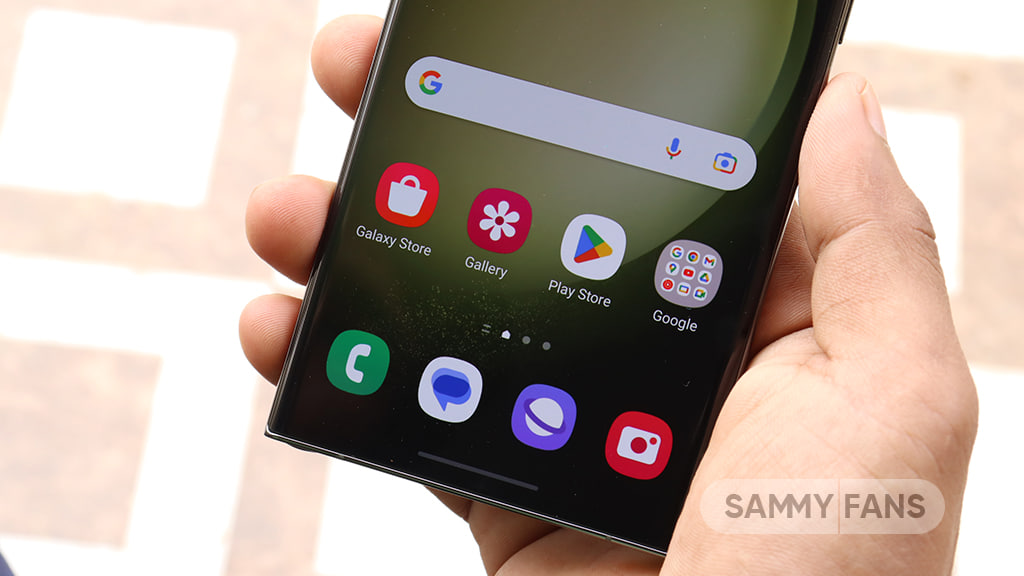
Google Messages introduces a new Backup and Restore feature to make it easier for users to back up and restore their text messages, media, and settings directly within the app. This feature’s strings have been spotted in the Google Messages 20241118_02_RC00 beta version.
Currently, Android users back up their messages through Google One at the system level, but this new update lets users manage backups from within Google Messages itself.
The backup system will offer end-to-end encryption, ensuring that your messages are fully secured. Only you will be able to access the backup, with protection provided by your device’s screen lock.
When signing into the app on a new device, your conversations will automatically restore, providing a seamless transition. However, some devices without a screen lock may not be eligible for encrypted backups.
The backup feature is closely associated with your Google Account and Google One storage, which means you’ll need some extra storage space for backups. While users can choose to turn off backups at any time. Turning off the backup will permanently delete your conversations from your Google Account, although they will still be on your device.
You can also choose to back up media only over Wi-Fi, which can help save mobile data. Additionally, Google Messages will allow you to sync messages across different devices as long as you’re signed into your Google Account.
Aside from this, Google Messages recently rolled out the “Double tap heart ‘feature for Android users. This makes it easier to send a red heart emoji in response to messages.
Google Messages rolls out ‘Double tap to heart’ for easy reactions


