News
Android 15 to enhance readability with color contrast settings

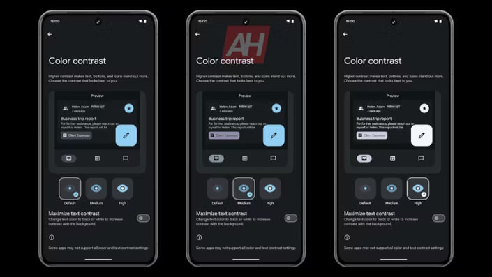
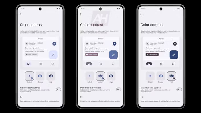
Google is bringing a new feature with the Android 15 update, which will allow users to adjust the color contrast of text on their screens to make it easier to read. The update is based on the Material You design, which adapts app colors to match the user’s wallpaper.
According to @MishaalRahman, the ‘color contrast’ feature was initially found in a beta version of Android 14 but is expected to be more user-friendly in Android 15.
On the color contrast page, users will have the option to select from light, medium, or high levels to improve visibility according to their preferences. Additionally, users will have the option to underline text to enhance its visibility against various backgrounds and improve overall readability.
Follow our socials → Google News | Telegram | X/Twitter | Facebook | WhatsApp
Android 15 will include a preview option that lets you see how text contrast changes will appear before applying them. However, it’s important to note that some apps might not support all the available contrast options.
While the ‘color contrast’ page was discovered in the Android 14 QPR3 Beta 2.1 version, it’s expected to be more accessible in Android 15 under Settings >> Accessibility >> Color and Motion.

Through this new feature, Google wants to make Android devices more accessible and comfortable for all users, regardless of their visual needs. This feature is expected to be released later this year with Android 15.
Android 15 to feature modern status bar with new icons, haptics