Apps
WhatsApp verified tick finally matches X, Facebook and Instagram

WhatsApp is updating its verification badges by replacing the green tick with a new blue one. This change is currently being tested with beta users on the Google Play Beta Program.
The new blue tick is a symbol of authenticity for verified channels and businesses on WhatsApp. By matching with the color scheme used on other Meta platforms like Instagram and Facebook, WhatsApp aims to make it easier for users to recognize official accounts.
This enhancement not only improves visuals but also strengthens security by providing a clear marker of verified authenticity. The switch from green to blue provides a secure environment and aligns WhatsApp appearance with other Meta services.
WhatsApp users who have installed the latest beta version 2.24.14.18 can check the blue checkmark on the official channels. This feature will gradually rollout to more beta testers in the coming days.

Apps
Samsung One UI’s often ignored app wins Bronze

Samsung Global Goals app wins Bronze in the “Partnership or Collaboration – Responsible Technology” category of the 4th annual Anthem Awards.
Although the Global Goals app comes pre-loaded in One UI, it often gets overlooked by Samsung users. It’s a dynamic lock screen wallpaper service, that funds UN for Global Goals through ads.
Samsung has crafted the Global Goals app in partnership with UNDP. It empowers millions worldwide to contribute directly to the 17 Sustainable Development Goals, AKA Global Goals.
Anthem Awards is an annual affair, which honoured One UI’s often ignored app with Bronze. It highlights Samsung’s continued dedication to fostering impactful, technology-driven solutions.
“We are truly honored to have our commitment to the Global Goals recognized by the Anthem Awards,” said Stephanie Choi, EVP & Head of Marketing, Mobile eXperience Business at Samsung Electronics.
The platform recognizes initiatives that leverage technology responsibly through strategic partnerships to address societal challenges and promote ethical technology use.
The future of Samsung’s Global Goals app
The South Korean tech giant reiterated its dedication to harnessing the power of technology to inspire collective action, open collaboration, and creating a better future.
As Samsung moves towards 2030 alongside the UNDP, the Global Goals app will remain vital for driving action and progress toward achieving the Global Goals.
Apps
Google revamps Circle to Search with app drawer and chunkier design

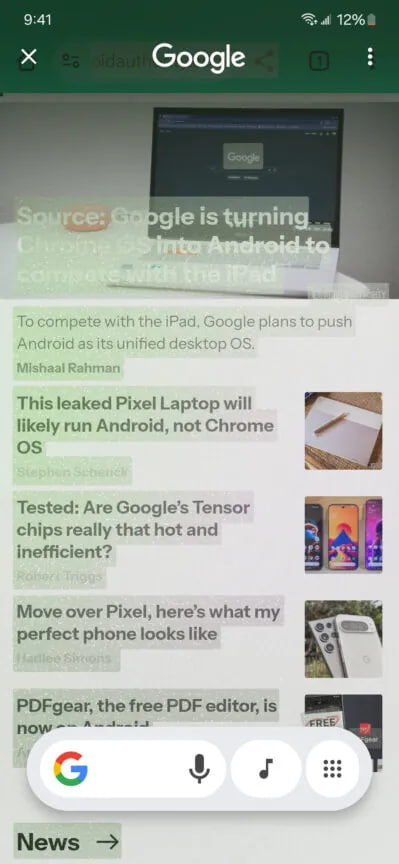
Google has introduced a new design for its Circle to Search feature, which lets you quickly search and take action on things you see on your screen. This revamped interface is a part of the Google app version 15.45.43.ve.arm64 beta update, bringing some noticeable changes.
The update brings a new look to the Circle to Search interface. The design is now chunkier, with a rounded box around the search bar and buttons to encase the elements.
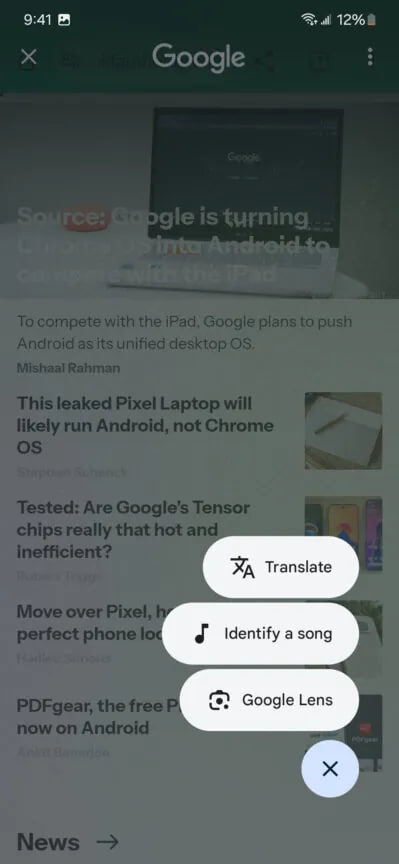
The most important change is the replacement of the Translate and Google Lens buttons with an app drawer button, spotted by Android Authority. This means that instead of having those features directly in the search bar, you’ll need to tap the app drawer to access them. This change comes after Google removed the Lens button from the search bar a few weeks ago.
While some users might find the extra tap annoying, the app drawer helps Google make space for more features in the future. The search bar has already been getting smaller over time, and the app drawer helps prevent it from being messy.
Moreover, the Music Search button stays in its place next to the search bar, but users are hoping Google will allow them to customize which shortcuts they want to show.
The new design may take some time to get used to, but it looks like Google is making room for even more features in the future.
Aside from this, Google is also reportedly working on a feature that will let you use Circle to Search with videos, though it’s still unclear which platforms will support this feature.
Google’s Circle to Search Lens removed from your Galaxy: Here’s Why
Apps
Google Authenticator 7.0 introduces new way to copy 2FA codes

Google has just recently released a version 7.0 update of its Google Authenticator app, which arrives with some helpful changes that make using the app simpler and more user-friendly. Along with a fresh look, there are some changes to how you manage your 2FA (Two-factor authentication) codes on Google Authenticator.
Previously, you had to long-press on the six-digit code to copy it to your clipboard. Now, with the new version, a single tap on the code is all you need to copy it. While long-pressing still works sometimes, tapping is the new default way to copy codes to make it faster and easier.
The app’s design has also been updated with a fresh update. In the 6.0 version, you had to long-press to access options like editing, deleting, or rearranging your accounts.
In version 7.0, you can now swipe right to rename an account, swipe left to delete it, and drag to reorder your accounts. These 7.0 changes make it quicker and more intuitive to manage your list of 2FA codes on the Google Authenticator app.

Moreover, the update also includes Dynamic Color support, which allows the app to match your phone’s theme for a more personalized look. It also adds a Privacy Screen for additional security.
Furthermore, the update brings a new account search feature to make it easier to find specific codes if you have many accounts. The update is available on Play Store, you can install it now to enjoy fresh changes.
Google Messages rolls out ‘Double tap to heart’ for easy reactions


